Skincare advertising exists in feeling. Consumers don’t purchase a product due to a spec sheet, they react to how it is going to feel against their skin. It is for this reason that visuals that imply touch, moisture, and softness are more important than ever. You can start with Dreamina by creating a believable hero image; an AI photo generator provides you with quick, high-quality images that render pores, sheen, and fine detail in a way that reads authentic and premium. You then add light, color, and movement to create campaigns that look like the product even before anyone has ever tasted it.
Texture as storytelling
Texture is a language. When an image appears velvety, the observer interprets that as “gentle.” When a bottle glints like glass, the brain hears “luxury.” Good skincare ads trace product benefits onto touch cues: the viscosity of a serum is seen in the way a drop clings to a pipette; the softness of a moisturizer is hinted at by a blur of cloth and gentle highlights.
Color as ritual
Skin care color palettes function similarly to fragrance notes in perfume: they establish expectation. Blue, watery hues read as hydration. Peach, golden tones read as comforting nourishment. Neutral shades, pale beiges, muted olives, tend to speak of science-first, minimalist philosophy.
Employ gradients to imply layers of concern instead of dense blocks of color. Gradient effects, such as a cream fading into a soft peach, mimic absorption in the imagination of the viewer.
Honest texture: before, during, after
Before-and-after narratives succeed when they’re limited and ethical. Employ the same lighting and angles. Alter only the characteristic that the product purports to change. If the product claim is hydration, demonstrate the same zone of skin with the same expression and camera settings, only then will a subtle jump in dewiness be believable.
For promotion, micro-demos work better than lengthy descriptions: one pearl-sized drop on the back of the hand, spread once, provides the observer with everything they need to visualize texture and absorbency.
Identity that sits naturally on the surface
Brand marks should look as if they’d always belonged in the shot, not stuck on. Think of a tiny logo in the corner, a textured inside cap with a pattern, or an elegant monogram embossed into label texture. Such touches keep the identity front and center but restrained.
If you require a rapid set of mark variations to try over pack shots, social banners, and UI, an AI logo generator can hasten the ideation stage, create options, and then edit the best ones manually. The ultimate mark must be legible at an infinitesimal size and delicate enough to accompany skin, not dominate it.
Motion and micro-interaction: feeling through sight
Motion must follow product behavior. Consider micro-animations like they were touch cues:
-
A 200–300ms shine that moves across a bottle implies a glassy lid.
-
A 150–250ms wave when a drop lands on skin implies absorption.
-
A gentle particle drift implies light textures like mists.
Test motion always on small screens. Small loops must feel like a gesture, not an event.
UGC and community cues
Invite actual people to show texture. Provide contributors with a brief that’s easy to follow: same point of view, natural light, no dense filters. Request three brief clips, not edits, so real texture is revealed. Offer a mini style guide (angles, color temp, and two-shot rules) so UGC can sit alongside hero assets without visual whiplash. Short shots or micro-jobs, “place pea-sized dot, swipe up”, keep submissions uniform and real.
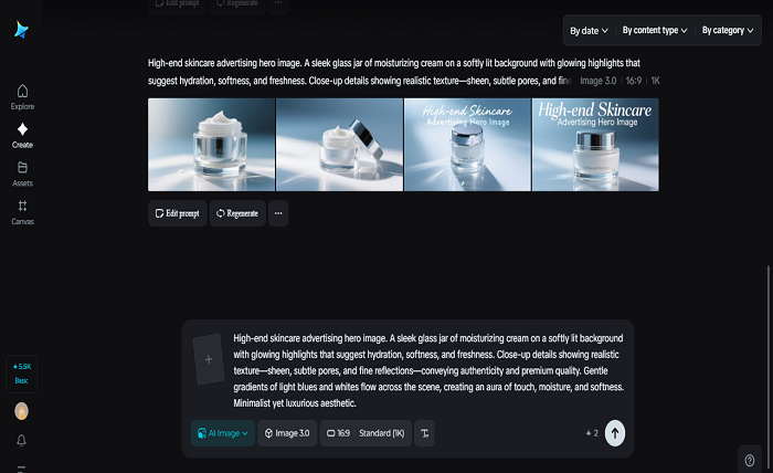
Dreamina’s three-step studio loop
Step 1: Write a text prompt
Open Dreamina and define texture, finish, and light. Be specific: refer to pore visibility, emphasize softness, the material of the bottle, and mood. The more precise the prompt, the nearer the generated image will be to the haptic brief. Sample:
Believable pores close-up portrait with dewy finish, soft backlight through diffusion, glass serum bottle with micro water beads, pearly peach-to-cream gradient background, premium editorial tone.
Step 2: Refine parameters and generate
Select the model style that looks most appealing to you, aspect ratio (vertical for Stories, square for feeds, etc), and resolution – 1k for quick explorations, 2k for final assets. Next tap Dreamina’s icon to create your batch! You want to evaluate phone size and full resolution, while rejecting anything that loses detail upon resizing.
Step 3: Customize and download
Hone your selected image with inpaint for minor adjustments, utilize fill out to create clean negative space, remove loose artifacts with erase, and use retouch to get the sheen and texture level. When the image feels tactile at both thumbnail and full size, click “Download.” You are now ready for composing or printing!
Physical extensions and tactile merch
Take the campaign into touch points. Small things create big impressions: embossed postcards, soft-touch print finishes, or sachet samples that replicate the campaign’s sheen and color. To achieve low-cost swag with a high-end feel, adapt your campaign’s minute icons or micro-illustrations to stickers; Dreamina’s sticker maker is a speedy means of generating tactile badges fans will stick onto laptops and diaries. Those physical tokens make the brand less of an advertisement and more of a ritual.
Checklist for fast production
-
Lock camera angle and lighting before color or texture.
-
Maintain subtle skin detail; don’t over-smooth.
-
Couple animation timing to perceived viscosity.
-
Proof print a small sample for color and sheen checks.
Conclusion: design that teaches touch
Skincare advertising works when pictures instruct touch. The appropriate combination of light, texture, and restraint persuades consumers prior to trials. Begin with the intention of touch, repeat with Dreamina’s prompt-adjust-customize cycle, and convert pixel feeling into physical moments your community will believe. Make the visuals seem like a ritual, and the brand is now part of the ritual. With careful imagery and thoughtful light, your campaign won’t just display skincare, it will make individuals feel it.